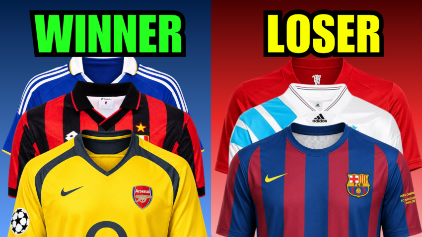
Here’s a theory I can’t stop thinking about. When it comes to Champions League final kits, the team wearing the uglier one almost always wins. I know that sounds crazy. But I’ve gone back and looked at the evidence — and honestly? The proof is right there.
Now, before you click away, I want to be clear about something. These are my opinions. You might completely disagree with me on some of these, and that’s fine. That’s actually the point. Football fans love to argue about classic football kits almost as much as they argue about football itself. So let me know in the comments which ones you think I got wrong — I can take it.
Here are five Champions League final kits where the better-looking shirt walked away as a loser. And if any of these vintage football shirts catch your eye, there are links throughout to buy authentic ones.
Affiliate disclosure: This post contains affiliate links. If you click a link and make a purchase, we may earn a small commission — at no extra cost to you. All opinions are our own.
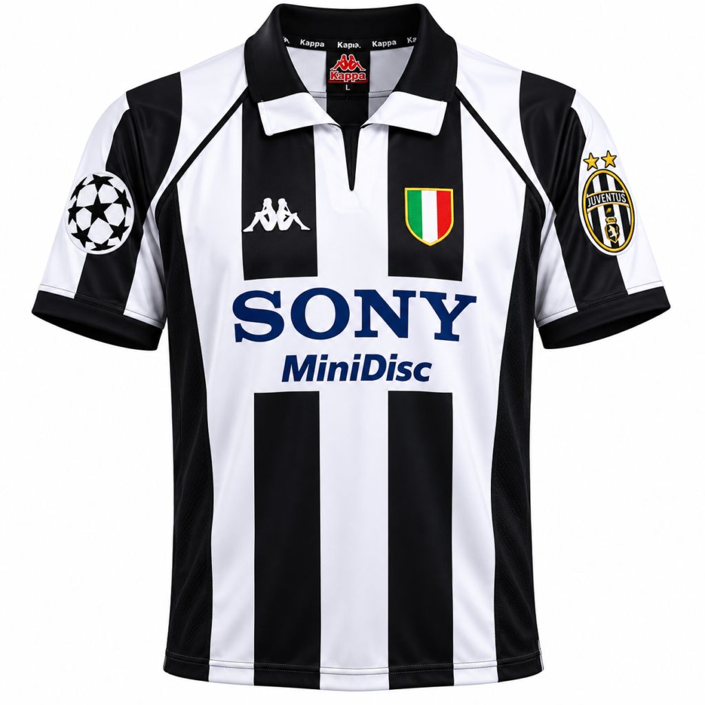
1998 — Real Madrid vs Juventus
Let’s start here. One of the most talked about Champions League final kits of the 90s.
Juventus showed up in their classic black-and-white stripes — Kappa badge on the chest, Sony MiniDisc across the front.
That Kappa era of Juventus kits is honestly one of the most iconic periods in retro football kit history for any club.
When I look at it, I immediately think of Del Piero and Zidane. Two legends of that generation, wearing that shirt, on the biggest stage in European football.
The kit almost sells itself.
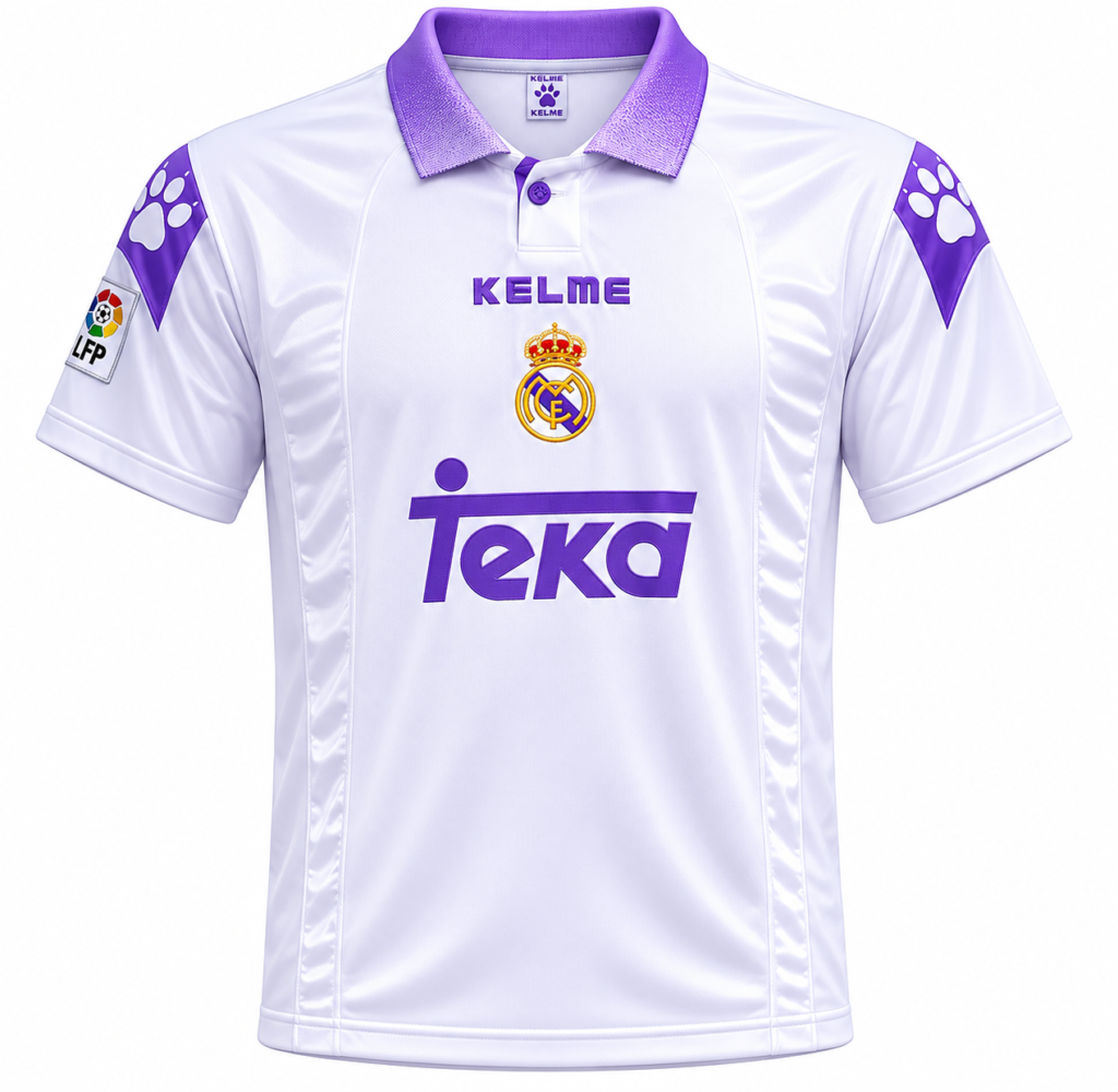
And then there’s Real Madrid. Their home kit that night was the classic white — no complaints there, white is timeless for Real.
But look closer. Purple trim on the collar. Purple on the shoulders.
The sponsor in purple. The names and numbers on the back are also purple. It’s like someone at Kelme had a purple phase and just went for it.
When I picture a Real Madrid classic football kit, this is not what comes to mind.
Real Madrid won the final that night. Juventus went home with the better kit and nothing else.
Verdict: Juventus had the better kit. Real Madrid had purple trim on everything. Real Madrid won.
1992 — Sampdoria vs Barcelona
Technically, this is a European Cup final — the very last one before UEFA rebranded the competition to the Champions League.
So yes, it counts as part of this discussion about Champions League final kits.
Barcelona won the trophy that night on a Ronald Koeman free kick in extra time, and this was Cruyff’s famous Dream Team — Guardiola, Stoichkov, Koeman, the whole lot.
A genuinely special team.
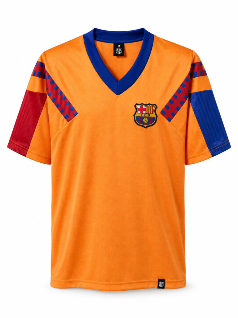
The kit, though? Not special. Barcelona wore this bold orange Meyba shirt with diagonal chevrons across the shoulders. It’s a lot to look at. And not in a good way.
It looks like a decision someone made in a hurry and nobody questioned.
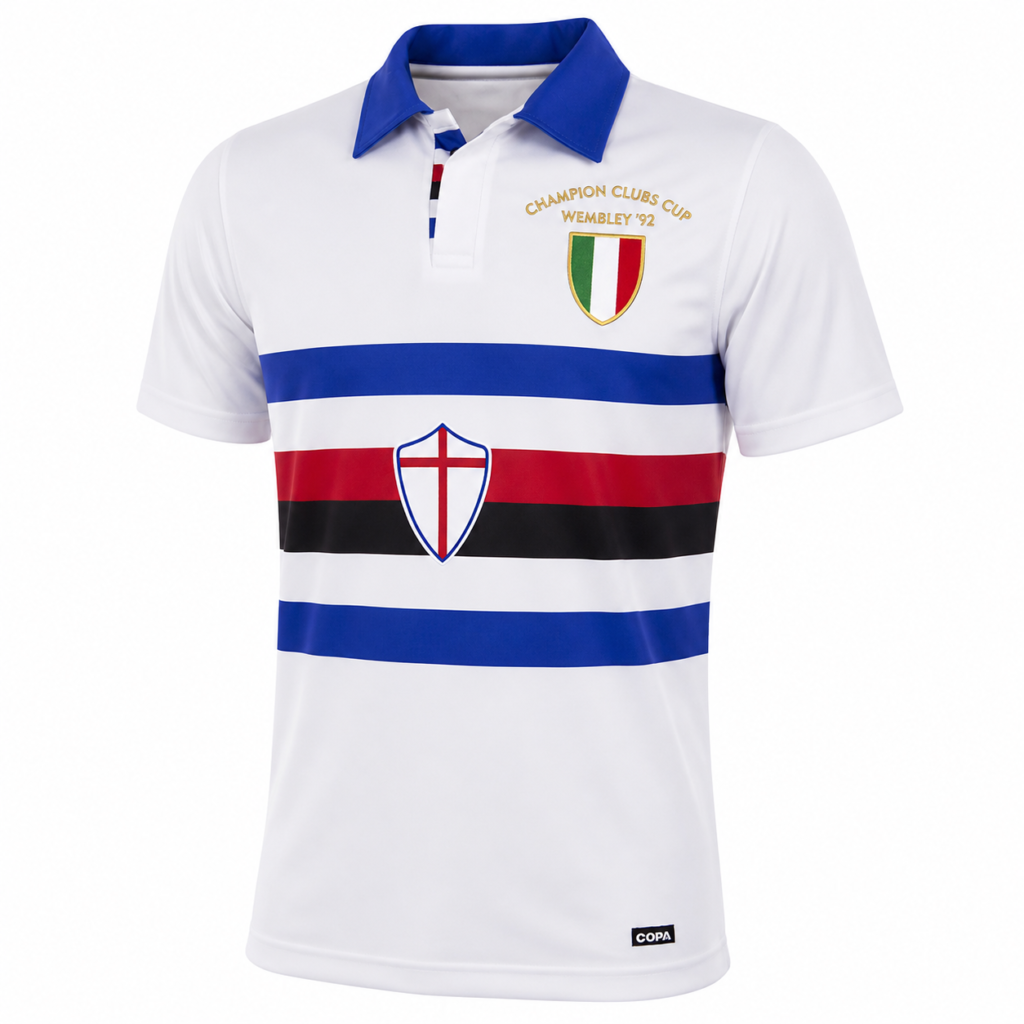
Sampdoria, on the other hand, wore something brilliant.
White base, horizontal stripes across the chest in blue, red, and black — and they went completely sponsorless for the final.
No logo. Just the badge and the shirt. It has this clean, vintage football shirt feel that makes you want to own it.
That Sampdoria shirt is the kind of retro football kit you hang on your wall.
Verdict: Sampdoria had the better kit. Barcelona had diagonal orange chevrons. Barcelona won.
1993 — Marseille vs AC Milan
This is the first-ever Champions League final — 1993: Marseille versus AC Milan.
One of the most iconic Champions League final kits matchups in football history.
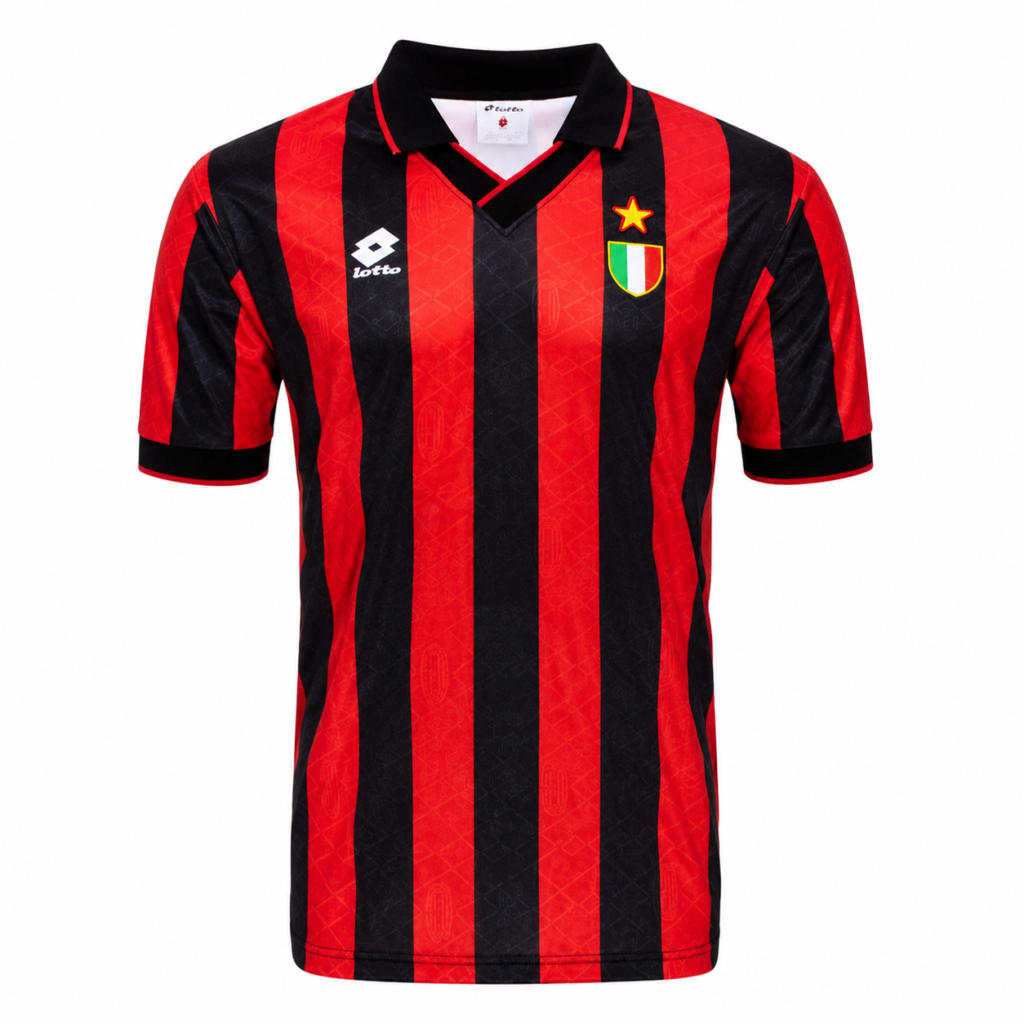
And this one hurts a little, because AC Milan brought one of the most recognizable classic football kits to this game and still went home trophyless.
The red and black vertical stripes. The Lotto badge. The subtle pattern running through the fabric.
When people think of AC Milan, this is the shirt. It’s Maldini. It’s Baresi. It’s Van Basten, who actually played in this final.
Arguably one of the greatest squads ever assembled, wearing one of the most iconic vintage football shirts in the sport. They lost.
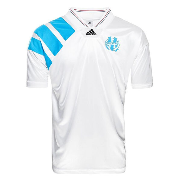
Marseille’s kit? It’s fine. A white base, blue Adidas stripes on the shoulder, Panasonic sponsor, and club badge. I’ll be honest — if I saw it in a shop I’d probably consider buying it.
It’s not bad. But compared to what Milan was wearing? It doesn’t come close.
And then it got worse. It later came out that Marseille had been involved in a match fixing scandal. Their president went to prison.
Not only did the uglier kit win, but the uglier team also won in every sense of the word.
Verdict: AC Milan had the iconic kit. Marseille won despite a match-fixing scandal. The ugly kit curse at its worst.
2006 — Arsenal vs Barcelona
Okay. This is the one where I’m going to lose people. I already know it.
The 2006 Champions League final kit matchup — Arsenal versus Barcelona in Paris.
Both shirts are genuinely good — I’ll admit that upfront.
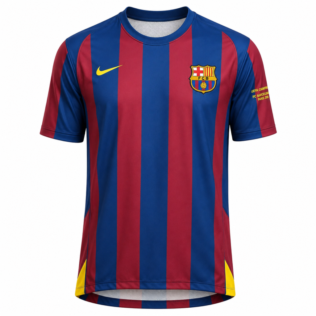
Barcelona’s home shirt is clean, the blue and red stripes are timeless, and its lack of sponsor keeps it looking sharp.
A lot of vintage football shirt collectors go after this one specifically because of Ronaldinho, and I get it.
He was the best player in the world at that moment.
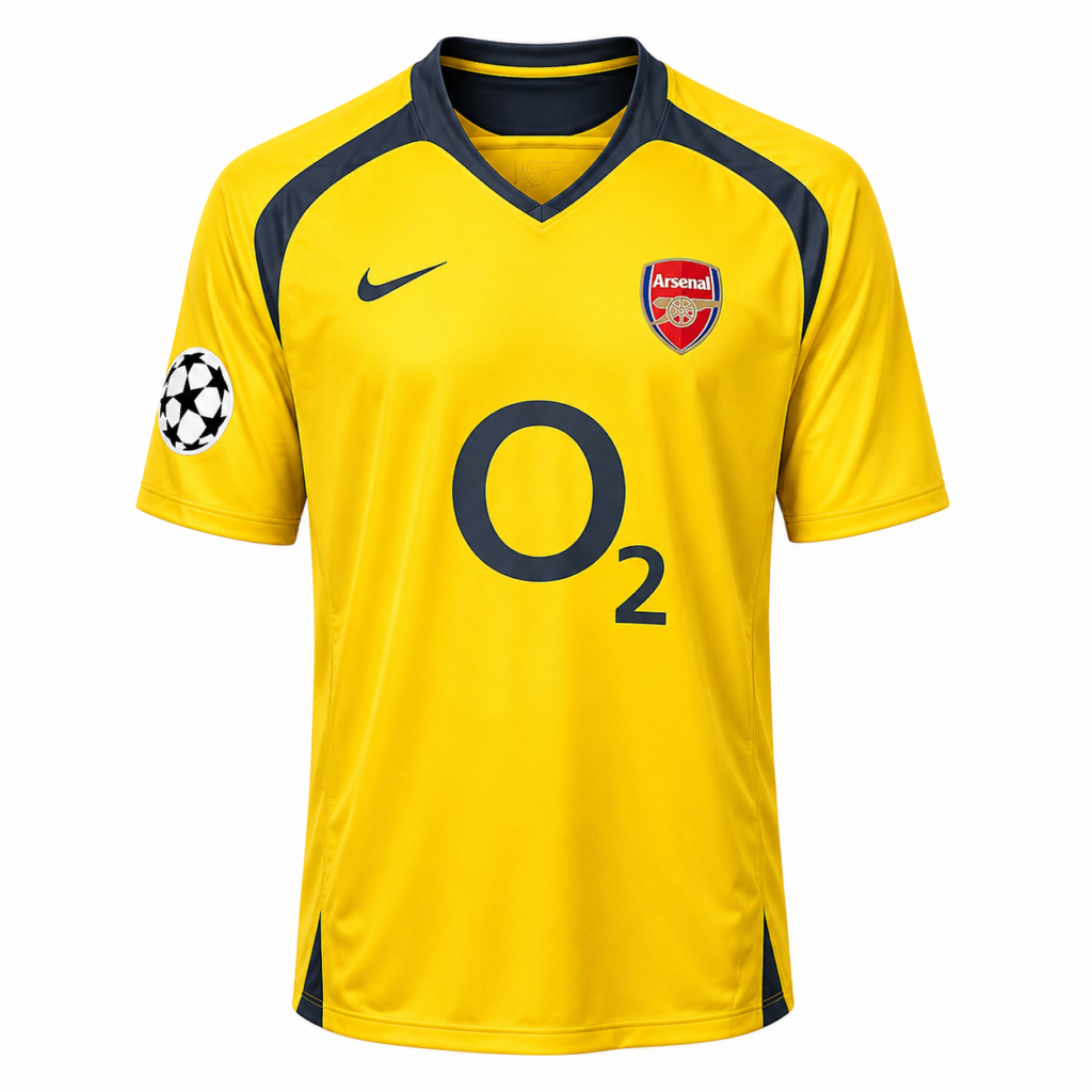
But if I’m being completely honest — and keep in mind I’m a Chelsea fan, so this is genuinely painful to say — I think Arsenal’s yellow away kit is better looking. It pops.
That yellow with the dark collar just works visually.
And when I see it, I think of Thierry Henry.
One of the greatest strikers to ever play the game. That classic football kit carries weight because of him.
Barcelona won. Arsenal had the kit I preferred. The curse continues.
Verdict: Arsenal had the better-looking kit, in my opinion. Barcelona won. Yes, I just said an Arsenal kit looked good. Moving on.
2008 — Chelsea vs Manchester United
And here we are.
The one that cost me sleep. The 2008 Champions League final — one of the most memorable Champions League final kits clashes — Chelsea versus Manchester United on a rainy Wednesday night in Moscow.
I am a Chelsea fan. And every single time I see Chelsea’s kit from that night, all I can picture is John Terry slipping on that penalty. Every. Single. Time.
But we’re talking about the kits, not the trauma.
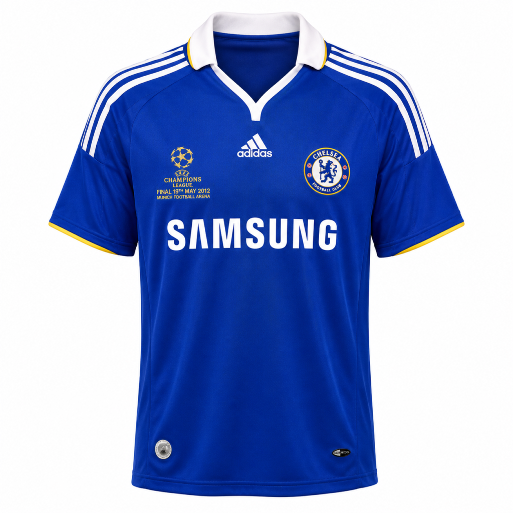
Chelsea’s home shirt that night was genuinely good.
The royal blue, the white collar, the clean white trim on the shoulders, and the Samsung logo sitting boldly on the front.
You think of Lampard, Drogba, and Joe Cole.
That retro football kit represents a whole era of Chelsea football. It’s a proper shirt.
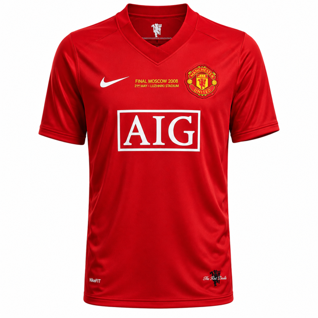
Then there’s Manchester United. And look — it’s just red.
That’s it.
Red everywhere, with AIG slapped across the chest in a big white box. AIG. An American insurance company.
On the shirt of one of the biggest clubs in the world. In a Champions League final. It does nothing for me.
There’s no personality to it. It’s just… red.
United won. Terry slipped. The ugly kit took the trophy again. I’m fine. Completely fine.
Verdict: Chelsea had the better kit. United had AIG on its chest. United won. Still hurts.
So What Does This All Mean?
Five finals. Five Champions League final kits that looked better than their opponents.
Five times, the better-looking shirt went home empty-handed.
Is it a coincidence? Probably. Does it make for a great argument with your mates? Absolutely.
The truth is, football kit history tells stories.
The ugly ones, the beautiful ones, the ones that make no sense — they all end up meaning something to someone.
A vintage football shirt isn’t just fabric. It’s a moment. It’s a player.
It’s a memory of where you were when that final whistle blew.
And with the Champions League final coming up this weekend between PSG and Arsenal, one of them is going to lift that trophy in the uglier kit.
That’s just how this works.
The ugly kit curse doesn’t care about design.